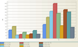
Although the upgrade has been available for quite a while, we finally got our BioPlex upgraded to the new software. As far as actually running the instrument, there's not that much of a difference in the work flow that would require re-training. It should look very familiar to you. The new features, however, are very useful, and exist mostly in the reporting of the data, and some new regression tools. Probably the single best feature of the new software is the graphs module. You can actually create very useful graphs right inside the BioPlex Manager Software. It's probably graphs that you're already creating inside excel, but not you can quickly and easily create them within the software and export as an excel graph, or as a bitmap image file. The best part is that you can do this on all the data you've ever created with the BioPlex, and to illustrate that, I took a results file that was on the computer, opened it up in 5.0, and created this graph shown above. It's basically showing you 9 cytokine levels of 2 samples (X9 and X10) in a bar graph. This literally took about 5 seconds to set up. Pretty cool. I was able to figure out how to do this without reading the manual in about 3 minutes, so the software continues to be very user friendly. Let me know if you want me to show you any of the new features, or if you find something cool yourself, be sure to pass along the info to us.
No comments:
Post a Comment