
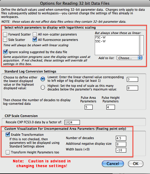
There are basically 3 things you can modify when adjusting the display transformation. They are the Number of decades, Additional negative display size and the Width basis. The Number of decades controls, to a large extent, how many decades of dynamic range is shown for events greater than zero. By default, this is 4.5--even if you export 5.5 decade data, use 4-4.5, otherwise too much visual space is devoted to the lowest decade. Additional negative display size controls, to a large extent, how much visual space to devote to events that have values less than zero. Since we are displaying data on a log scale, zero is not defined. So, there needs to be a way to display data around zero that makes sense. This is what's at the heart of the biexponential display. Near zero, the log scale becomes linear so that zero can be defined, and then goes back to log when safely in the negative realm. The number of channels around zero that are transformed into the linear realm is defined by the width basis. By default, FACSDiVa uses a width basis of -100, whereas FlowJo's default is -10.
So, how does this affect your data? Well let's take a look at an example. FITC and PE stained capture beads were run on a FACSCanto and exported in the FCS 3.0 format. No compensation was done at the instrument, and single stained controls were used to compensate the data in FlowJo. Below is the uncompensated data file as well as a compensated file using the defaults that were currently applied.


Looks pretty good, but let's take a look at some simple tweaks. For this, we'll go to the Platform menu, then Biexponential Transformation and then Manually Specify Transformation, which will bring open the window to edit the transformation settings.
Again, we have the option to change the width basis, Positive decades and Additional Negative Decades. Let's assume we're not going to change the Positive decades, so we'll focus on what the width basis and negative decades will make. Below are the plots shown at each of the width basis presets. As you can see, the main affect is squishing the data closer together around the zero point. Good to get data off the axis, but you can easily take it too far and end up reducing your ability to resolve dimly stained cells from unstained cells.


The question then is how much transformation do you apply? One strategy that I like to employ is to try and visualize this better with a contour. The goal is to remove the bimodal-like profile of the populations as they cross the zero point. Once I'm able to do that, I then increase the amount of negative log space so that most of the data is not on the axis. For example, below I show a -10 width basis, 1 additional negative log in a contour plot. In the brightest peaks, it is easy to see a pronounced dumbbell shaped population straddling the zero point. If I modify the width basis a bit to get rid of the dumbbell shape, and then reduce the additional negative space to remove extraneous white space, I get a profile like the one on the right. Notice that each axis is done separately and can have different width basis and negative logs to achieve the best transformation.


Once all is said and done, I now have a well transformed plot that is worthy of publication. Below is the original uncompensated plot, the default transformation, and the modified transformation.

A few tweaks and a bit of trial and error is all you need to get visually pleasing plots that will actually help you make better decisions in terms of region drawing and data interpretation. So, please feel free to play around with these settings and see how well you can transform.